
It is not the noise of your platform, but the strength of your message and how many choose to listen. As the first analysis to detect and warn of the excess mortality signal in late 2021, this is the culmination in the article series that shifted the world’s perception of the Covid mRNA vaccines.
Marking the 277th week of the SARS-CoV-2 pandemic, this article provides a detailed examination of excess mortality rates in the U.S. through Week 25 of 2025, with a focus on the primary contributing factors. Despite challenges in visibility and varying levels of its censorship across platforms such as Apple, LinkedIn, YouTube, and Facebook, this analysis strives to present an unbiased, evidence-based perspective on the trends and causes behind the rise in ongoing excess mortality rates.
Abstract
While the Covid mRNA vaccines may have provided a therapeutic effect during the fall 2021 B.1.617.2 variant wave, helping to keep some vulnerable individuals out of the hospital, this benefit did not translate into reduced infection rates or into any arguable offset in overall mortality.
In contrast, the Week 14, 2021 inception of the mRNA vaccine has led to a pronounced and pervasive inflection in mortality across multiple-dozens of ICD codes. This shift has resulted in more than 840,000 excess deaths from causes other than Covid or non-natural means (see Charts 3b and 4c). These deaths have come mainly as a result of the vaccine itself (see Charts 3c and 3d) – a mortality total which is 25 times greater than the 33,000 lives the CDC claimed could have been saved by the B.1.617.2-valent vaccine during the Delta Variant wave. Nations with a low rate of Covid and high rate of mRNA vaccination serve to confirm both the timing and cause of this excess mortality.
The mRNA Vaccine Continues to Kill 2,000 to 4,000 Americans per Week Now – (See Charts 3, 4c, 10, 11, 12, and 13)
We Also Have a Cancer Emergency Developing in Its Early Stages – (See Charts 6, 7, and 11)
As of Week 25 of 2025, 5.33 years into the Covid-19 Pandemic and its aftermath, 1,865,928 excess deaths have been recorded to date. Now certainly, the SARS-CoV-2 virus was a deadly pathogen, itself 6.6 times more deadly than the typical annual mortality total for all influenza viruses combined. However, as the reader will infer from the material below, it was the panic-fueled, and in some cases malicious, actions of those few in power which have served to precipitate the larger part of total excess mortality during the pandemic, as well as post-pandemic, periods.
As of June 21st 2025, there have been
843,922 Excess Non-Covid Natural Cause Deaths (primarily from the Covid Vaccine),
253,830 Excess Non-Natural Deaths (including 130,000 sudden cardiac deaths in casual drug users),
384,763 Excess Deaths from Malpractice and Denial of Treatment,1
383,413 Excess Deaths from the SARS-CoV-2 virus (6.6 x annual influenza-pneumonia)2
making for a grand total of 1,482,515 (79.5%) Manmade Excess Deaths of US Citizens, out of a Pandemic Total Excess Mortality of 1,865,928. These statistics are summarized in the chart below:

Background
A wide diversity of ‘Omicron’ variants were discovered to have been percolating throughout global populations in 2021 (we contend that the mutation rate, the immediate high genetic diversity, as well as the genetics themselves indicate circulation since 2017), featuring a Case Fatality Rate which turned out to be curiously on par with the well-established annual HCoV and flu mortality benchmarks (a metric of human frailty as opposed to necessarily just pathogen virility). This far lower CFR of 1.0 to 6.6 (also corroborated by means of CDC data in Chart 1) versus Wuhan-Alpha-Delta strains is substantiated by the Our World in Data dataset, and can be seen in Exhibit A below.

As one may observe, ‘Omicron’ is about half as deadly as was the 2009 H1N1 flu. It arrives amazingly at a CFR of about the level of a normal year’s influenza and pneumonia.
Therefore, something else is behind the non-Covid excess natural cause deaths of our younger citizens which began in mid 2021 (and it is not Covid-19, Long-Covid, lockdowns, nor fentanyl).
Notice that public health authorities never cite this. Notice as well, how they avoid the implication that the diverse set of ‘Omicron’ strains were the most likely candidate to have produced Pacific Asian immunity to Wuhan-Alpha-Delta (and not their ‘lockdowns’, which thereafter showed to be ineffective beginning with 2022 strains in Asia – amazingly right on time for the well established four-year HCoV mutation/infection cycle).
Thus, it became increasingly clear throughout our analysis that most of the globe (having already been exposed to lower-mortality proto-Covid variants) fared Covid-19 relatively well because of the advance immunity imparted in the years prior to the official pandemic. Moreover, that disruption, lockdowns, iatrogenics, denial of treatment, along with our quod fieri final solution, have collectively served to kill the majority (namely 1,482,515 or 79.5%) of the US Citizens who died during the 277 weeks of the pandemic and its aftermath thus far. It is clear, despite the original danger presented by the Wuhan through Delta variants of the SARS-Cov-2 virus, that this circumstance quickly escalated into a man-made tragedy within the United States and other Western nations.
USA Weekly Mortality
– (Real) Excess All Cause Mortality – 6.1% (or 3,424 deaths)
– Nominal Excess All Cause Mortality – 1.4%
– Excess Non-Covid Natural Cause Mortality – 6.5% (or 3,103 deaths)
– Excess Non-Natural Mortality – 4.0% (or 202 deaths)
– Covid UCoD Mortality – 119 deaths (51% lower than same week of 2024)
The beige line in the chart below shows the actual CDC Wonder deaths per week for the two years prior, as well as years-of and years-post the pandemic. The dark orange baseline is normalized from the years 2014-2019, representing a 1.14% annual growth in mortality for the US in terms of all causes. This 6-year baseline reflects a balance between a retrospective lengthy enough to provide statistical significance, but not so long as to be confounded by generational effects or immigration impacts.
Please note that we do not employ the incorrect terms/metrics ‘crude mortality rate’ and ‘age-standardized mortality rate’ (Chart 2 outlines our terms and metrics). These indices are used to compare death rates between nations in a normal circumstance, not for a retrospective impact of a black swan event inside a single nation.3 This is an essential element of professional competence.

Covid is Currently Not As Dangerous as Annual Flu or Even Common Cold
The currently observed excess mortality in Chart 1 above is not caused by Covid or Long Covid.
Chart 1b below, titled “COVID-19 UCOD Mortality,” depicts weekly COVID-19 deaths from 2020 through 2025, showing a dramatic decline in mortality over that time — in particular after Covid-17 (Omicron) reemerged and produced significant Covid-19 (Wuhan-Alpha-Delta) immunity in Western populations in 2022 (see Exhibit A). The early pandemic waves associated with SARS-CoV-2b variants (Wuhan through Delta) produced pronounced peaks, whereas the later Omicron lineage (SARS-CoV-2a) exhibits a sustained and minimal death rate. By Week 37 of 2025, COVID-19 mortality is shown to have fallen 64% year-over-year and 66% over two years, with its current death rate at just 43% that of influenza and pneumonia. These data indicate that COVID-19 has diminished to a level of lethality below that of seasonal influenza—and potentially comparable to or milder than common respiratory infections in the elderly.

The chart below, titled “Chart 1c – Average Age of COVID-19 Death Exceeds Cohort Life Expectancy,” illustrates that individuals currently dying with a COVID-19 underlying cause of death (UCOD) are, on average, living beyond their statistically expected lifespan for their age cohort. Based on provisional CDC/NCHS data for 2025, the chart shows that COVID-19 mortality remains overwhelmingly concentrated among older adults, with deaths increasing sharply after age 65 and peaking in the 85+ group. The median age at death is 79.5 years—exceeding the current U.S. life expectancy for an 80-year-old (78.4 years) and matching that of a 70-year-old in 2015 with three or more comorbidities (79.5 years). This relationship suggests that many COVID-19 UCOD assignments may reflect incidental or end-of-life conditions rather than true primary causes of death.

Therefore, there exists no argument basis from which to mandate Covid-19 vaccination for any population or cohort.
There’s no way to sugar-coat this folks: The Covid-19 mRNA shots have more than a dozen documented mechanisms by which they can induce and promote cancer. These genetic-therapy interventions are dangerous and potentially deadly. They must be pulled from the market.
Replications and Corroborations of This Work
This chart of course, reconciles with each of the other charts inside this system reporting summary article. We track this system coherency each week to make sure that the entire set of metrics agree with one another.
Modeling a system is like driving a car or conducting a symphony. One is comparing hundreds of inputs for consilience in development of a dynamic description of reality. Everything must work in concert and/or agree. Cursorily scanning the side-view mirror on GitHub, and quibbling with people who have never driven a car in their life, over whether that was a truck or a smudge on the glass, is irrelevant and unproductive. A mere exercise in wanna-be ego.4
This article presents a dynamic systems analytics/intelligence derivation argument. This is not ‘statistics’ and it is not ‘technical analysis’. The mission therein resides in detecting active signal, not comparing batting averages or political candidate approval ratings on a simple spreadsheet. Anyone who has run a business of a significant size knows that intelligence derivation is foundational to success.
When professional systems engineers replicate this work, they corroborate the answers therein
When honest academicians replicate this work, they corroborate the answers therein
When professional actuarials replicate this work, they corroborate the answers therein
When professional epidemiologists replicate this work, they corroborate the answers therein
When doctors examine and replicate this work, they corroborate the answers therein
When third parties conduct the same analysis, they corroborate the answers therein
When other analysts replicate the cancer analysis, they corroborate the answers therein.
When national scientists replicate this work, they corroborate the answers therein.
When professional demographic analysts replicate this work, they corroborate the conclusions therein
When insurance industry analysts replicate this work, they corroborate the excess mortality.
When non-pharma-affiliated scientists replicate this work, they corroborate the excess cancer mortality.
“Our findings raise serious concerns regarding the potential impact of the vaccination campaign and other causes on mortality. A detailed cause-specific investigation of such a significant excess number of deaths is warranted to explore the potential factors leading to this concerning and unexplained increase in population mortality.” ~ Economidou, et al., “Excess Mortality in Cyprus during the COVID-19 Epidemic”5
I do corroborate or falsify my various model conjectures (you don’t see the hundreds which showed as invalid), in the form of retrospective, derivative, cross section, spanning tree, delta-sensitivity, constraint reference testing, and comparative analyses – and not through wasting precious time in trivial arguments with inexperienced pretenders under extreme agency or bias. After all, this is what a systems professional naturally does – one who is used to having their work be subjected to intense scrutiny by knowledgeable client stakeholders as opposed to angry ad hominen focused pretenders.
Time renders the truest of peer review, surpassing the collective savvy of all experts.
If one uses only raw data to craft these charts they will always get a wonderful-looking trend in death. Back when Covid cases were varying highly by season, in a quarter where the case trend ended below the pandemic line, did that mean that the Pandemic was over? No. The same principle applies here then, one cannot use mere raw data (especially one stand alone metric) to draw inference. In general, there are eight adjustments or exclusions/inclusions one need make (depending upon the data scraped/linked) to raw data obtained from the CDC/NCHS:
Weeks -1 to -12 for state reporting lag(need for this practice ended in Feb 2025)- Weeks -1 to -25 for RXX (abnormal findings) hold code shortfall depletion (depends upon ICD code)
- Weeks -1 to -25 for 999 (non-natural suspected) hold code build (before dump to Non-Natural ICD’s)
- Weeks -12 to -35 for erosion from ICD reassignment by CDC
- Weeks -12 to -35 for erosion from UCoD to MCoD reassignment (see Chart 5) by CDC
- Weeks -26 to -35 for reassignment of Natural Cause Deaths into Non-Natural (see Chart 4c)
- Pull-Forward Effect adjustment (see Chart 3b) of the baseline deaths anticipated for 2021 through 2027
- Correction to data when NCHS/States fell short on reporting. In each case the CDC/NCHS was notified of, and acknowledged, the shortfall: Weeks 20 – 24 of 2022, Weeks 42 – 48 and Week 50 of 2024.
- An allocation of excess MCoD Cancer assignment, above and beyond past practice, that changes the context of Cancer Mortality post-Covid vs pre-Covid, is added back into UCoD Cancer Mortality (see Chart 6), per Chart 5. This however does not serve to compensate for all death certificate fraud. Actual rates of cancer are higher and growing faster than those shown in this article.
Please note however, that the provisional mortality figures for 2018-2024 are lower than the figures prior to 2018 because the NVSS suppresses county level data with fewer than nine records. We do not adjust 2018 and later mortality figures upward for this. Therefore, these excess mortality projections are lower than the reality as a result. For this reason, all inflection-DFT charts begin with the 2018 suppressed data, in order to avoid false ‘downtrends’ or inflections in the data.
All of these adjusts are either marked on the charts below, or are outlined as to how they are obtained, in a separate chart. If an analyst does not track these confounders faithfully and weekly over time and compare their relative impacts in terms of a total system, or if they dilute a signal through growth by a population which does not exhibit the mortality in question – mortality inflections and trends will be diluted – suggesting an entirely wrong (rosy) short term result. The bad news will only show up in the data years later. Of course, this is the actual plan.
That being said, let’s now examine the various metrics of excess mortality as of Week 25 of 2025.
Balance Sheet – USA Excess Weekly All Cause Mortality – 6.1% or 3,424 Deaths
Evaluating Asymmetry without Univariate or Gaussian Blindness
When examining excess mortality metrics and considering them in the context of the broader summary of excess mortality, the resulting balance sheet (shown in Chart 2 below) is derived. A crucial distinction between systems analytics and mere ‘statistics’ resides in the requirement for systems dynamics to comprehensively depict an entire schema of interdependent relationships, in terms of both end-to-end agreement and coherence. Such systems engineering expertise and rigor characterizes both my academic foundation as well as my five-decade-long professional career. Such exemplifies as well the distinction between a hack or journeyman technician, versus a real scientist.

How Statisticians and Fake Experts Cheat to Dilute and Hide This Signal

The reader should note that the CDC eliminated reporting of the Big 12 ICD categorizations (their Morbidity and Mortality Weekly Report) at the end of September 2023. This data set was useful in helping spot anomalies (‘Pull-Forward Effect’ for instance) in the rates of death in the US, and in preventing paltering and torfuscation of the baseline in order to make later years appear to have less excess death. To this end, below are the five dishonest tactics employed by fake analysts and pharmaceutical narrative science advocates:
Paltering (boosting the baseline – UK example here) – crafting a baseline inflated by rolling or factored-in 2020-23 excess deaths. Alternately, counting excess Covid mRNA vaccine deaths for 2025 and beyond as ‘expected’ deaths. In some cases, pretend analysts will smooth over recent 5-year legacy trends or even brazenly craft an entirely fictional new uptrend in baseline, departing from a longstanding legacy baseline, in a desperate attempt to make excess mortality disappear.
Torfuscation (hiding the bodies in the bog) – failing to adjust 2021-2027 baseline downward by Pull-Forward Effect (PFE). Exploiting Simpson Effect by blending the Pull-Forward Effect of older age brackets with the excess mortality in younger ones, to derive a false arrival which is approximately close to a projected baseline.
Simpson Per Capita Dilution (diluting signal with non-salient ‘population growth’) – making per capita or per-100K adjustments to a signal in a subpopulation
- which has had its candidate population shrink and not grow (over age 75 for example, post pandemic),
- for which the population growth bracket-profile does not match the profile/death risk of the group from which the signal has been extracted (eg. immigration-influenced growth applied to ‘heart disease’, ‘cancer’, or ‘Alzheimer’s’),
- for which the analysis is crafted to detect a short retrospective inflection/excess and not a generational trend,
- where the growth trend line itself already reflects the rate of population growth inside its historic metric,
- using population projections made prior to a black swan event (Covid-19), or
- employing migrant-fueled population growth rates.
Gaussian Blindness – the warning flags of a data charlatan:
- Applying linear regression analysis across an entire non-linear, depleted, or inflected data set.
- Applying linear or least-squares regression on all annual data points (rather than the stable and more comparable trough references – see Exhibit 3 for example of this practice’s effectiveness), to include single-event surges in peak data which serve to bias the baseline.
- Employing a linear trend line when a dynamic baseline is the professional standard for signal analysis.
- Depiction by means of a ‘quashed-y’ or ‘zero-base’ chart combined with a linear regression on a high magnitude data set.
- Depiction by ‘quashed-x’ or a cherry picked time axis such that an inflection is concealed behind a conveniently selected regression line and time frame, which both shows the trend desired and/or hides the signal in question.
- Employing monthly or annual figures as opposed to using the actual weekly data.
Age-Standardized/Crude Retrospective Analysis – employing PFE-absent and age-standardized ‘crude’ analysis to a retrospective analysis of one nation during a black swan event, when age-standardized analysis is used for comparing metrics between nations during a normal circumstance.6
Errant Census Bureau ASMR Denominator Data – While it is often claimed that the Census Bureau adjusts age cohorts annually to account for categorical deaths, this is demonstrably not the case. During the COVID years and beyond, the Bureau misrepresented the population figures for the 72+ age cohort, relying on algorithmic projections rather than actual death certificate data from the National Center for Health Statistics (NCHS). This discrepancy underscores why age-standardized mortality rate (ASMR) indices are unreliable when applied within a single-nation retrospective analysis.
For example, the entire SARS-CoV-2 Pandemic in Sweden can be made to disappear completely by using all these tricks listed above in order to deceive. A comparative of Sweden’s truth vs statistics-lie can be observed by clicking on this X-article link. By using these tricks, one can make any mortality signal, or even the entire pandemic, falsely appear as if it did not occur at all.
~ The Cheats of Covid Narrative Science
Here we provide a link to a clear example of these techniques in action to make the entire pandemic statistically disappear. If one can make the entire pandemic disappear through these data tricks, they can certainly deceive the public into believing that no rise in cancer exists as well. Such elicits a key principle to grasp here: there is no data available which refutes this comprehensive analysis. One can hide the signal through bad technique or extreme single-use constraint (works with one graph but produces incoherence in others). But they cannot refute it through equivalent systemic corroboration or better data. Trained professionals understand why this litmus is important. A false modus tollens is the signal of a corrupt argument.
These data magic tricks are not merely unethical, but when enacted by public health authorities, are also immoral. Just as in the case of their refusal to release V-Safe data, vaccine cohort data, or spurious VAERS record disappearances, data sets effective in targeting the harm introduced by the Covid-19 mRNA vaccine are all being systematically screened from public access. These are human rights crimes.
Beware he who would deny you access to information, for in his heart he dreams himself your master.
Accordingly, we put together a scrape which assembles the same data from Wonder, as one used to be able to obtain from the CDC Weekly MMWR Report, so that we are able to continue this tracking (that is, until they eliminate Wonder altogether and simply appeal to tyrannical authority in its absence). We also have kept a backup of the old MMWR data to show how the CDC palters the baseline in the years to come.
The following charts all feed systemically into and reconcile inside the summary balance sheet above.
USA Excess Weekly Non-Covid Natural Cause Mortality – 6.5% (3-sigma) or 3,103 Deaths
The beige line in the chart below shows the CDC Wonder Excess Non-Covid Natural Cause deaths per week for the two years prior, as well as years of and years post the pandemic. The dark orange baseline is normalized from the years 2014-2019, representing a 1.12% annual growth in mortality for the US in terms of all non-Covid natural causes. Just as in the case of all this specie of charts, the 6-year baseline reflects a balance between a retrospective substantial enough to provide statistical significance, but not so long as to be confounded by generational effects or immigration impacts.
Understanding the Pull-Forward Effect (demarcated as ‘PFE’ in orange), represented by the reduced orange baseline observed in Chart 3 from 2021 onward, is crucial when evaluating Excess Non-Covid Natural Cause Mortality, as well as in actuarial and epidemiological studies more broadly. This is because the combined effects of excess mortality and temporary decreases in mortality following a pandemic can offset each other, a phenomenon known as the Simpson effect, leading researchers astray. This has been evident in the analysis of the Covid-19 pandemic, where analysts have consistently arrived at incorrect conclusions about the relationship between the vaccine and excess mortality due to a lack of understanding in addressing this aspect of the data.
Understanding the Morbidity and Mortality Weekly Reporting hinging around Week 14 of 2021 is crucial for grasping the dynamics of Excess Non-COVID Natural Cause Mortality. This specific week marks the period of most rapid administration of both doses of the COVID-19 vaccine. Upon analyzing numerous charts illustrating etiological and causal influences, it becomes evident that this particular date consistently emerges as a notable turning point.
Two prime illustrations of this vaccine inflection date impact can be observed in the US Natality Birth Weight Chart and the US Infant Not Alive at Time of Natality Report Chart. The Procedure for development of these charts can be found by clicking here.
Long Vaccine not Long Covid
A recent Yale study examined 42 patients with Post-Vaccination Syndrome (PVS) and 22 healthy controls, stratifying both groups by SARS-CoV-2 infection history. Among PVS participants, over one-third had no serological or self-reported evidence of prior COVID-19 infection, yet still developed persistent symptoms such as fatigue, neuropathy, brain fog, and exercise intolerance following vaccination. These symptoms, along with significantly lower General Health Visual Analogue Scale (GHVAS) scores and impaired PROMIS-29 metrics, closely mirrored the clinical profile of Long Covid. Notably, symptom severity was comparable between vaccinated individuals with and without prior infection, and the majority of PVS cases arose only after the first or second vaccine dose. Those who experienced PVS early (after dose 1 or 2) opted out of subsequent boosters, thereby truncating what might have otherwise been a number-of-doses sensitive escalation in PVS symptoms observable in aggregate data.7
These findings support the hypothesis that in some or even most instances, what is regarded among pateints as Long Covid may instead be a form of vaccine-related chronic immune dysregulation, particularly in patients without confirmed prior infection. In other words, Long Covid, is a socially trained self-diagnosis regarding PVS.

Perhaps the only good news to be found within Chart 3 above is the flattening in this Excess Mortality trend for most of the years 2023 and into 2025. However, we have documented (in Charts 3b and 8) that this is simply an impact of the Pull-Forward Effect (because of our conservative choices with regard to its metrics), so we will watch how this excess trends over the outyears in order to discern what is indeed occurring. Morevover, as of mid-2025 the metric has taken on a new slope since late 2023, one which is slightly higher than that of the legacy baseline.
This surge in excess natural-cause mortality post–Covid vaccine is corroborated across roughly half of other Western nations, each showing the same pattern of excess deaths emerging after their vaccination rollouts (a clear example is shown here).
Unfortunately however, this excess mortality replicates in other highly mRNA-vaccinated nations, even in absence of a heavy history of Covid infection or mortality. In addition, in 2024 insurance industry professional analysts corroborated this excess mortality and its persistence. To wit:
Excess mortality was the bane of the [life insurance] industry’s financial results over the last few years, leading to depressed earnings and losses. The term is a polite way to say more people were dying than was expected or predicted, thus the policy claims were higher and the payouts greater than the companies had reserved for.
[That] Death toll remains ‘alarming.’
~ Insurance NewsNet: Excess Mortality recedes, but remains above normal, 7 May 20248
No Sympathetic Variance Between Excess Non-Covid Natural Cause and Covid-19 Mortality
The question therefore arises: “Is the arrival of each week’s Excess Non-Covid Natural Cause Mortality simply a case of ‘missed Covid-19 deaths’?” The answer to this question is an unequivocal ‘No’. In Chart 3b below, one can observe the progressive loss in covariance between Covid Mortality and Excess Non-Covid Natural Cause Mortality across the retrospective horizon. Basically 3 phases of covariance progression between the two metrics exist:
Significant Relationship (Mar 2020 – Jul 2020) – the timeframe wherein the two indices behaved with extreme covariance during the period before comprehensive PCR testing was in place. Indeed, during this timeframe many Covid-19 deaths were missed and not counted.
Slight to No Relationship (Aug 2020 – Mar 2022) – during this period, the relationship between the two metrics all but disappears. A slight sympathy develops as Covid begins to shift its mortality to the more traditional Nov – Feb high mortality timeframe for all death ICD codes (the scalloping shown in Chart 1 above). This creates a pseudo-trend in relationship between the two metrics (yellow dotted regression line), which is not real. In other words, this is Covid-19 Mortality becoming more conformant with natural cause death patterns (see Chart 1), than it is Excess Non-Covid Natural Cause Mortality becoming conformant with Covid-19 deaths.
No Relationship Whatsoever (Apr 2022 – now) – since the arrival of the diverse set of ‘Omicron’ variants of Covid, there has existed zero relationship between Excess Non-Covid Natural Cause Mortality and Covid-19 Mortality.

Accordingly, there has existed little to no sympathetic statistical relationship between Excess Non-Covid Natural Cause Mortality and Covid-19 Mortality since the introduction of widespread PCR testing in mid-2020. Excess Non-Covid Natural Cause Mortality is not a case of ‘missed Covid-19 deaths’.
Pull-Forward Effect (PFE)
Please note that no argument or chart in this analysis is ‘completely dependent upon’ Pull-Forward Effect. PFE is an addition to the critical levels of signal and excess mortality indicated in each chart herein, constituting a mere 20 to 35% of any excess in any given MMWR week. We merely contend that, correct levels of excess mortality cannot be estimated (for any nation or ICD code) without this critical and real arrival function being taken into consideration.
Pull-Forward Effect (PFE) – when in a given population, a large number of older citizens (in the case of Covid-19 an average age of 82 years) die to the excess in a given short timeframe, due to an exceptional cause (famine, war, pandemic, terror) – then a given set of successive years of baseline death rate for that population or any particular cause of death must be lowered by a function of that excess death for an actuarial-derived period thereafter.

The function we currently use for PFE is described by 6.6 years (345 weeks – April 2021 – Oct 2027) of Chi-squared arrival, with an anticipated x_mode (function peak) of mid-late 2023 at 6.42% of Excess Non-Covid Natural Cause Mortality. Only 729,791 (61%) of the net 1.2 million older person deaths are claimed inside this entire PFE function. The arrival argument is depicted above in this PFE Reference and Calculation Basis Chart. We will continue to update this arrival function (as we have in the past) based upon the patterns observed inside the eleven key PFE index recitations outlined in the following paragraphs, through and including Chart 3b.
The basis of our Pull-Forward Effect (PFE) calculations can be seen by examining the dip-to points in the DFT Chart (3b) below, which shows clearly the 2021-2023 shortfall trend in All Non-Covid Natural Cause Mortality for ages 75+ (antimode minimum = -15.6% PFE). The older-citizen sensitive Alzheimer (G30) ICD mortality (-18.5% PFE), Bladder Cancer mortality (-10.1% PFE), Lung Cancer mortality (-12% PFE in ‘unhealthy quotient’ timeframe), and Dementia and Related mortality (-7.8% PFE) trends over this same period are suitable for confirming this Pull-Forward Effect deficit (most of these show trough points in April 2023 currently). In addition, the Pull-Forward Effect is corroborated by
- Influenza/Pneumonia, Diabetes, and Alzheimer Mortality shortfalls (-5% to -14%) in Chart 2 above,
- MMWR/Wonder data on the Primary 11 ICD Mortality codes (-5.9% in 2023),
- the November 2023 Society of Actuaries Mortality Survey Report (-8% at 2023 peak in oldest age brackets),
- in the United Kingdom’s summary of Primary ICD Mortality (-20% to -27% in classic age-associated ICD codes),
- Brownstone Fellow Bret Weinstein and Phinance Technologies CEO Ed Dowd in this December 2024 Dark Horse Pandemic Assessment video.
Collectively, these ten benchmarks more than substantiate our 6.42% drop (at peak, mid-2023) in baseline expected for Excess Non-Covid Natural Cause Mortality (seen as the baseline adjustment in Chart 3 above, and in Chart 6 below). As a reminder, this constitutes use of ~64% (for conservancy) of the available (true) PFE shown in Chart 3b below.
Therefore, the conservancy we employ is on the order of 35 to 40%. The actual PFE is almost double that used in our models. We presume for all intents and purposes that 470,000 of these 1.2 million older-citizen Covid-19 deaths ‘would have lived forever’. Such highlights the ridiculous levels of conservancy we have gone to in order to appease pretend critics.

Note that Pull-Forward Effect has turned the corner on its antimode minimum as of July 2024. That means that the peak in PFE has come and gone. Mortality rates will begin to rise now, and this illusion of ‘attaining baseline’ which the fraudsters are selling will dissipate.
The above DFT model indicates that, of the 1.851 million excess deaths to date, around 735 K of those deaths (for our purposes) happened early, or were ‘pulled forward’. This will continue to increase across a total period of 6.6 years of baseline. Our models in Charts 3 above and 6 below have only used 467,205 of these 735 K in PFE deaths as of Week 19, 2025 – so 64% of the actual PFE indexed from Chart 3b above (very conservative). The remaining persons not included in this 345-week PFE total are assumed to ‘live forever’, for purposes of conservancy. Thus, this PFE allocation is very conservative. (Please note that, while we use the arrival form of the shortfall in 75+ Non-Covid Natural Cause Mortality, we do not use the percentage magnitude. Our peak PFE used for April 2023 is 6.42% of Excess Non Covid Natural Cause Mortality (suitably confirmed by the 5.9% Primary ICD measure above), and not the 17.9% shown in Chart 3b).
The Pull-Forward Effect can be seen as well inside cancer mortality within older age groups, as indicated in the 75+ age bracket Deviation from Trend charts.
When Pull-Forward Effect, and trend modeling are employed correctly, they result in the disciplined, reliable, and clear modeling of Excess Non-Covid Natural Cause Mortality (expanded Chart 3 below). There is no need to dilute the figures by population growth, as population growth is already incorporated into this baseline. Inside this chart, one has everything they need to calmly and objectively comprehend, replicate, and confirm my work.
Correctly Defining Baseline vs Huckster Methods
The procedure for assembly of this scalloped baseline can be accessed by clicking here. As one can observe, the fit between actual mortality and projected baseline using this method, is extraordinary. The dotted line at the base of the scalloping, intersecting the baseline each August timeframe, is not a regression line. It is a visual reference used at the base of the scalloping because the base of the annual seasonal fluctuation acts as a superior reference as compared to the mids and the peaks, which bear too much volatility and variation by season and year to act as a linear reference.
These arrivals however, do not always involve a linear regression baseline. The chart in Exhibit 3 illustrates a level of accountability that none of the naysayers have achieved with their hasty linear regression graphs to date.
All-Data-Point Linear Regression is a Fraudster’s Heuristic and Here is Why

Using the disciplined method depicted above, which incorporates the Pull-Forward Effect (PFE) and a more reliable baseline trend, we estimate that 828,500 non-Covid natural cause excess deaths have occurred through Week 21 of 2025. This excess mortality is primarily attributable to the Covid-19 vaccine. The conclusions we derive from this are as follows:
- Referencing growth from the least volatile context—specifically, the summer mid-trough months, weighting increasingly more recent years, and avoiding anomalous one year surges or depressions—on a weekly basis offers a superior method for accurate analysis. Academic approaches such as annualized figures, per-capita dilutions, monthly averages, and full-year, monthly, or Gaussian least squares/linear regressions (the fuchsia line in Exhibit 3 above) will serve to palter (distort) the baseline and yield inaccurate progressions in excess mortality. These methods often overweight anomalies in the data, such as remote-in-time depressions (Summer 2014) or surge asymmetry (Winter 2017/18), which are frequently misinterpreted as trend data by less competent analysts. Such anomalies should not be considered part of the background rate, and conflating them with broader trends can lead to erroneous conclusions.
The calculations and method used to establish a salient All Cause Mortality growth rate (1.14% from Chart 1 and Exhibit 3 above) can be seen by clicking on this extract from our 2014 – 2019 baseline module for Chart 1. This is the same approach I have used to estimate category and product line growth for major clients for decades. I maintain a successful track record and stellar industry reputation in this type of strategic analysis. A similar method is employed as a facet of competitive advantage in my successful ‘category killer’ retail company as well. I am more than happy to work with sincere questions on various industry approaches to analysis, but if you preface your ‘discussion’ with defamation of me or my professional brand, you will get a block or proactive response from my lawyer. - Therefore, the 2014 to 2019 dynamic baseline (represented in dark orange in Exhibit 3), which reflects a precedent growth rate of 1.14%, serves as a sound and valid reference for determining excess mortality.
- Non-Covid natural cause excess mortality shows a significant rise without relying on the Pull-Forward Effect (PFE). While PFE is an important complement to this analysis, it primarily serves to enhance the accuracy and validity of the excess mortality assessment. Leaving Pull-Forward Effect out of the above analysis, is another tactic of fraud on the part of bad-actor analysts.
- Using the method outlined here, we identified issues in the NCHS data during the summer months of 2024 and alerted both the NCHS and CDC to the discrepancies. The subsequent corrections caused increased volatility in the late 2024 numbers. As a note, despite the optical illusion created by the mid-summer dip, the trendline for those summer months is actually higher than that of 2023. This bears monitoring.
Resulting Covid-19 Vaccine Negative Cost-Benefit Function
In terms of US county-by-county arrival of this Excess Non-Covid Natural Cause Mortality, the heaviest concentrations of this death group has been in the most highly vaccinated counties in the US. In the dynamic analysis shown in Chart 3c below, one can see that this Excess Non-Covid Natural Cause Mortality both begins solely after the rollout of the vaccine nationwide, and as well bears its heaviest impact in those counties which are most heavily vaccinated. One cannot use state level data for this because of Hope-Simpson effect during the Delta variant timeframe (a competence flag in those showing such regressions) hitting south border states most heavily. This serves to impart a misleading Yule-Simpson effect in the state level data. Only county-level data is salient.

Despite this mRNA vaccine associated death quotient by US County (Exhibit 3c), the Covid-19 vaccines had no appreciable impact on Covid Mortality when analyzed by US County (Exhibit 3d below). Please note that US State level data is compromised (Yule-Simpson Effect) by Hope-Simspon Effect (seasonality by latitude for a virus) and the timing of the arrival of the Delta variant. For this reason, do not trust anyone who touts state level data.

A purported vaccine efficacy signal only showed in small sample hospitalization studies sponsored by the CDC. Lots of unvaccinated persons went to the hospital, but curiously they never showed up in the mortality totals. Statistically this is impossible. Moreover, when the CDC small study sample ratios are expanded to the entire population, the result is a severe overage in total mortality. Both of these falsifications bring the CDC Covid-19 Response, Epidemiology Task Force study integrity into question.
USA Excess Weekly Non-Natural Mortality – 4.0% or 202 Deaths
The beige line in the chart below shows the CDC Wonder Excess Non-Natural Cause deaths per week for the two years prior, as well as years-of and years-post the pandemic. The dotted baseline is normalized from the years 2014-2019, and comprises a 1.42% annual growth in mortality for the US in terms non-natural causes. This reflects excess mortality from unsound lockdown and open border practices, in terms of suicide, addiction, assault, accidents, abandonment, and despair (SAAAAD). Disruption (loss of access to medical services or medications) deaths are now included inside iatrogenic and denial of treatment tallies (medical mistakes).

It is our hope that the downward trend in this metric since mid-2021 continues until this mortality recovers its baseline. The jump which occurred in mid-late 2023 is something we are watching – however appears now to be a regular summer effect. However, given that a portion of these deaths each week are due to ‘unknown substance overdose,’ we anticipate that the trend will asymptote to +130 deaths per week in the years 2025 and beyond. Because of efforts to mitigate smuggling of fentanyl across the US border, along with its subsequent introduction into substances preferred by casual drug users, this excess death curve has undergone a steady decline over the 2023 and 2024 time frame.
However, it is also important to note that many of the excess deaths being attributed to Non-Natural Causes above, are actually from vaccine-induced myocarditis. The proof of this can be seen in DFT Chart 4c below. In addition, the NCHS is abusing this category after the fact in order to hide excess natural cause deaths during weeks -26 thru -50 (Weeks -13 thru -26 are the normal adjust period). We watch those adjustments in detail each week to ensure that these re-categorizations do not falsely deplete Excess Non-Covid Natural Cause Mortality (shown in Chart 3).
As can be ascertained from Charts 4b and 4c below, there exists absolutely no doubt concerning the relationship between the vaccine and excess death.

This effect has been coorobrated and confirmed by a November 2025 Kuhbandner, et al. German Study.
As well, the most impactful influence upon ‘unspecified drug overdose’ mortality in younger persons, has been the introduction of the Covid-19 vaccine. This is also confirmed by the Sudden Cardiac Death Mortality for ages 0-54 shown in Chart 10. The two charts bear concomitance, one of the strongest signals in analytical systems and science.

Recent policies targeting the closure of the border to illegal drug and human trafficking has saved lives. The Party was killing us.
USA Excess Weekly Cancer Mortality – 8.6% (14-sigma) with Novel 1.5% Nonlinear CAGR
It should be noted that our cancer findings herein have been professionally corroborated as of 12 Mar 2024.
Chasing truth means calling out the smoke and mirrors, even if it ruffles feathers. @EthicalSkeptic’s data on cancer mortality cuts through the BS.
~ @Grok, 8 Jul 2025
The green-to-red line in Chart 5 below shows the CDC Wonder Excess Attributions of underlying cause of death (UCoD) Cancer to multiple cause of death (MCoD) Cancer, per week for the two years prior, as well as years-of and years-post the pandemic. The dotted baseline is normalized from the years 2017-2019, and indexed to the last 7 week average as compared to those same 7 weeks of 2017-2019, so it is not a ‘regression’. Since this is a relative index, it should exhibit no trend or growth rate (outside the context of Covid mortality peak periods of course). The current excess in these deaths reflects cancer deaths which are concealed from the underlying cause of death ICD code, and must be added back into the mix in order to make Excess Cancer Mortality comparable to its past baseline. We reconcile this into Chart 6 below, applying it only after the pandemic period ended.

Note that the year 2017 in Chart 5 uses the correct total deaths for the year from the 1999-2017 Wonder data, but applies an average of the 2018 and 19 weekly arrival forms because Wonder does not offer weekly data in that linked data set. This method is still valid for differential calculations week by week.
Failure to normalize for MCoD Cancer using the above method constitutes an act of publishing fraud.
When done correctly and ethically, cancer shows a clear inflection in growth rate at Week 14 of 2021 – the week of fastest uptake in the mRNA vaccine within the US population (as can be seen in Chart 6 below). In fact, every single chart we have run which depicts an excess mortality currently underway (not all of them do this), indicate this same inflection point of Week 14 of 2021.
The discouraging news is that the 45-54 and 55-64 age bracket Deviation from Trend charts indicate a weighted average of 11% excess cancer mortality as of Week 10 2024. This is the real excess cancer rate, which is partly hidden (reducing it to ~6-8%) by the Pull-Forward Effect inside older age groups, as indicated in the 75+ age bracket Deviation from Trend charts.
The inflection point in the first set of charts for ages 45 – 64 bears a clear demarcation at MMWR Week 14 of 2021. The older age Pull-Forward Effect will not last long – whereupon this excess cancer mortality will begin to become undeniable.
This is unequivocal – the vaccine is causing excess death, and likely 95% of all of our Excess Non-Covid Natural Cause Mortality, the 828,500 deaths shown in Chart 3 above.
Moreover, cancer is a hard ship to turn; but once turned, will not come back to normal for perhaps decades. I contend that the outyear numbers will show that we have made, very possibly, a horrible mistake. Time will tell, but will also only whisper to those who bother to watch. I guarantee you that the smarter-than-thou among us, will not watch at all. Take this as a hint as to their agency and integrity. Nothing they proffer is honest – everything a rhetorical deflection and nothing more.
Take note in Exhibit 6 below, that TES was the first analyst to catch and publish an alert as to the rising cancer mortality signal as of 7 Aug 2021. Fortunately, millions listened.

This chart is expertly adjusted for Pull-Forward Effect (345 week PFE method is depicted in Charts 3b and 6) and excess MCoD attributions (critical data mining method depicted in Chart 5 above). In other words it is showing the true cancer UCoD rate (shorted by pressure on physicians to not report cancers unless ‘proven’ by multiple tests). Despite all these shorts in the data collection, the raw (and misleading) UCoD data nonetheless shows a rise – which can be seen by clicking here.
A bottom-up derivation analysis (which is essential for this critical rollup, yet few perform) of this excess cancer mortality shown in Chart 6, along with the observed Pull-Forward Effect, derived from the 16 leading causes of cancer deaths, can be accessed by clicking upon this image. From this, three things become clear:
- A tally of each ICD death cause sums up to the overall Excess UCoD Cancer Mortality I have been publishing = ~700-1050 per week in Chart 6 – both in terms of UCoD as well as MCoD.
- Every single sub-ICD chart for cancer inflects with the rollout of the mRNA Vaccine.
- Out of convervancy, we have only employed 64% of the true Pull-Forward Effect thus far. In addition, state medical boards are forcing many cancers to be misattributed to other ICD codes. This means that cancer mortality is worse than Chart 6 is even indicating.
These cancer outcomes have been corroborated by a South Korean retrospective study involving 8 million persons.10
The suggestion that the Covid vaccine may be linked to elevated cancer incidence is supported by a July 2025 Cox hazard cohort study by Martellucci et al., which compared cancer hospitalization rates in vaccinated versus unvaccinated populations.11
Both our Pull-Forward Effect (PFE) and the sharp 2021 emergence of the cancer signal we identified in July 2021 were later corroborated by a May 2025 McLoed, et al. peer reviewed study analyzing cancer diagnoses within the Ontario Health Insurance Plan (OHIP) dataset. Unfortunately, the authors attributed this rise in diagnoses to “deferred cancer screenings”—a claim made without presenting any supporting evidence whatsoever. Such an assertion, absent evidentiary foundation, constitutes a serious breach of research ethics.
This cancer inflection and novel nonlinear growth rate is corroborated as well by both the Producer Price Index for growth in the Surgical Equipment Manufacturing Industry, cancer diagnoses in England, as well as Google searches related to new cancer patients—all three of which inflected at Week 14 of 2021. It has been corroborated as well by Voya Financial Services as of December 2024, along with z-score confirmation by Alegria, et al that same year.
We show a rise in excess mortality from neoplasms reported as underlying cause of death, which started in 2020 (1.7%) and accelerated substantially in 2021 (5.6%) and 2022 (7.9%). The increase in excess mortality in both 2021 (Z-score of 11.8) and 2022 (Z-score of 16.5) are highly statistically significant (extreme events).
~ Alegria, et al.; US – Death Trends for Neoplasms ICD codes: C00-D48, Ages 15-4412
Our most recent rate increase is due to “Increased claim frequency for 2024 policy year observed across most categories, most notably in cancer diagnoses across younger ages.”
~Voya Financial raises premiums, 11 Dec 2024
Confirmation of Cancer UCoD Shorting = 24.5% Excess Incidence
In corroboration of this alarming set of indices with regard to Cancer, is the constant dollar rise in expenditures for cancer treatment within the United States as of end-of-month August 2025. The rise in Producer Price Index-Neoplasm Treatment highlighted in Chart 7 below is adjusted for both inflation in Medical Care Services (MCS) and group price escalations (commensurate with CARES Act). The actual raw BLS figures show an even more aggressive increase than the 11.7% 25.7% indicated on top right hand side of Chart 7 below.
With the currently measured rate of Cancer Pull-Forward Effect, the true excess Real Dollar Cancer Rate is 24.5%. This represents an additional $42.7 billion (without PFE included) in real dollars that consumers are spending each year to treat these new cancers.
As well, this has been corroborated by other systems professionals replicating this same work.13
The results indicate that from 2020 a novel phenomenon leading to increased neoplasm deaths appears to be present.
~ Alegria & Nunes, Trends in deaths from neoplasms, US (2024)14
Medicare Part B spending on antineoplastics rose from ~$15.6B in 2019 to $18.5B in 2022. Part D antineoplastics spending increased from ~$23B in 2019 to $32.1B in 2022. Doses/claims in particular were the impetus behind this: e.g., Keytruda users grew from ~30K (2019 est) to 67K in 2022. 2024 forecasts show a novel ~10% annual growth.
~ Sources: MedPAC, CMS Drug Spending Dashboard.

This stark rise in cancer treatment expenditures is corroborated by both the skyrocketing 2022/23 sales in cancer treatment drugs all across the board (save for sunsetting-lifecycle names), as well as the American Cancer Society’s Annual ‘Cancer Facts & Figures’ Report, which tracks cancer incidence by means of cases. The latter report (2024 is projected at the link provided) shows a clear 12.7% novel excess in cancer cases for both 2023 and projected 2024 (9.2% without Pull-Forward Effect), along with an increase of the cancer case growth rate from 1% to 2.7% CAGR (not influenced by PFE). These are depicted in Chart 7b below.
Note that Charts 7 and 7b agree in both magnitude and arrival form. The rise in cancer due to the vaccine is unequivocal.

Little of this excess cancer is attributable to the ad hoc rescue of ‘a deferral in cancer screening appointments’, as cancer rates have soared in younger ages (see Chart 11), the biggest cancers dropped in incidence (by Pull-Forward Effect), while at the same time the diversity of cancer mix, as well as a 2022 spike in incidence of rare and secondary cancers, collectively serve to belie this notion.
Finally, corroboration of the vaccine’s role in excess cancer mortality can be seen by clicking on this Top 17 vs Bottom 14 Vaccinated States Cancer Mortality chart. This chart compares the most and least vaccinated states in the U.S. and their respective excess cancer mortality rates.
In this chart, one may observe that the more heavily vaccinated states exhibit a 2:1 higher rate of excess cancer mortality compared to the lesser vaccinated states.
Corroboration by Fifteen BLS Medical Sector Economic Indices = 7 to 50% Elevated
While the data we have presented up to this point is certainly consistent, consilient, and overwhelming in its own regard—corroborated by over a dozen agencies and other analysts—the Bureau of Labor Statistics updates fifteen indices in particular that relate to expenditures within the Medical Services sub-vertical.
These fifteen Bureau of Labor Statistics Indices are all elevated, inflect with the introduction of the mRNA vaccine, and serve to corroborate our findings in spades.
The video sequence of charts shown below in Exhibit 7c are all (save for one Civilian Labor Force index) adjusted by Medical Services Inflation as applicable, as published by the Bureau of Labor Statistics, to ensure that they reflect constant dollar comparatives. The elevation in these indices falls anywhere from 7 to 50%—and all inflect with the vaccine uptake periods shown in red on each individual chart.15
Collectively, this is far more robust and significant analysis than is provided in a garden variety epidemiological study.
Accordingly, we now have both the mechanistic basis16 17 and the fingerprint signal (see Charts 6 and 7, a, b, and c)—evidence of the Covid vaccine cancer connection which, in any rational or ethically sound context, would constitute sufficient grounds for the withdrawal of the mRNA vaccine from the market out of precaution alone (eg. Rofecoxib (Vioxx), Merck’s COX-2 inhibitor, was withdrawn in 2004 after only about five years of post-market statistical-association). Versus the efforts linking smoking and lung cancer, we are only missing the case control and cohort studies – studies that will never be conducted inside the current political climate. This, in turn, serves as a powerful indictment of the entire vaccine industrial complex.
USA Weekly Abnormal Clinical and Lab Findings Excess Mortality – 49%
The beige line in the chart below shows the CDC Wonder Abnormal Clinical and Lab Findings deaths per week for the four years prior, as well as latest year of the pandemic. The dotted baseline is normalized from the years 2014-2022, and ends with a pronounced (normal condition) hockey stick formation in the last 33 weeks of the timeframe depicted. The excess above this dotted line reflects excess mortality of uncertain cause (ICD code R99 in particular). As depicted in Chart 8 below, to date this comprises 16,750 concealed death certificates.
As the astute analyst will notice, the peak weekly figure for Week 4 of 2024 had exceeded the old peak for Week 2 of 2023. Since this metric is also an excellent predictor of Excess Non-Covid Natural Cause Mortality (Chart 3 above), we are able to infer that the flattening from 2022 into 2023 observed in Chart 3 is due primarily to Pull-Forward Effect (PFE) and does not originate from a genuine reduction in vaccine-related deaths.

Before we broach the topic of our Deviation from Trend charts, it is helpful to remember that each of these charts feeds into the Chart 2 ‘Balance Sheet’ above – some charts show increases and inflections, other charts show nothing and/or decreases. Regardless, they do not constitute stand-alone conjecture. If one adjusts the parameters of these charts, then they lose agreement with the overall Balance Sheet depicted in Chart 2 above – and suddenly we have Covid or its mRNA vaccine fictitiously curing a whole host of diseases. One cannot tweak the analytics by means of stand-alone, trivial, or rhetorical critique – because they miss this type of inconsistency.
Every disagreement one brings to the table must be accountable to fit coherently inside the entire model – or it is merely an attempt to deflect, deceive, or push an uninformed opinion, and nothing more.
Deviation from Trend (DFT) – Inflection Charts
The following Deviation from Trend (DFT) charts—shown in Charts 10, 10b, 11, 12, and 13 below (and 4c above)—are developed using the linked Deviation from Trend Plot Procedure. These are not conventional ‘trend charts.’ Instead, they are short-term analytical tools designed to detect changes in direction within the data (inflections) and to measure the strength of those signals.
The ‘trends’ shown here must be interpreted in context:
- The entailed trends cannot be manipulated to remove an inflection signal—a practice sometimes seen with conventional trend charts.
- Their directional vectors are only salient in the short to medium term. They cannot be projected a decade into the future, nor should they be regarded as forecasts.
In short, these charts reveal dynamics in the data rather than long-term statistical patterns. Over time, they will need to be retired and the data transitioned into classic trend charting methods.
What, therefore, is an inflection in professional strategic analytics (not ‘statistics’)?
A distinct, statistically significant, and sustained change in the underlying dynamics of a data series — such as its direction, rate, or variability — temporally associated with a salient date, mechanism, or event.
This principle carries far more weight than a p-value or confidence interval. Such heuristics are fragile—overly sensitive to sample definition, model choice, noise, and the researcher’s framing. The epistemic strength of a recurring inflection lies in its cross-validation across contexts. Markets, pandemics, and national systems are inherently noisy, riddled with transient fluctuations. P-values and confidence intervals may test against randomness in a single channel, but they cannot capture systemic consilience across multiple channels. A 95% confidence interval in one metric can be rendered meaningless by model misfit, autocorrelation, or flawed screening criteria. Yet when the same inflection surfaces simultaneously in trade volumes, logistics delays, consumer sentiment, and pricing indices, the probability of a genuine structural shift rises dramatically—without the crutch of brittle frequentist scaffolding.
Strategy, in turn, demands anticipation and decisive action under live conditions, not retrospective inference that waits upon the slow machinery of peer review or the safety of armchair debates. Inflection detection is therefore an operational signal—and pandemics are operational crises, not academic exercises.

For this reason, when conducting strategy for a nation, market, or corporation, the essential skill is the ability to recognize inflections that consistently align with underlying conditions and emerge clearly through market, seasonal, or operational noise. This discipline is far more rigorous than reliance on academic heuristics alone. Without a reliable method to detect such inflections—whether in the sell-through of an import or the performance of an entire product family—strategic decision-making is left blind and reactionary.
And this is not something taught in universities. It can only be mastered through applied accountability and hard-won experience—by crafting strategies across diverse domains and directly managing medium to large enterprises. By the end of this article, one conclusion should be unmistakable: those who approach this domain armed from the outset with mildly inductive Bayesian constructs, cohorts, p-values, or confidence intervals demonstrate little comprehension of actual pandemic or market strategy, and fail to grasp the gravity and urgency of what they are analyzing. They cloak themselves in the affectations of science while sidestepping the real work that authentic strategic practice demands.
USA Sudden Cardiac Death/Myocarditis Excess Mortality Ages 5-54 – 61.1% (14-sigma) – 110,952 Related Deaths
The blue line in the Deviation from Trend (DFT) chart below (Chart 10) shows the CDC Wonder Sudden Cardiac Death Mortality per week for the two years prior, as well as four years of the pandemic, for the age 5 to 54 bracket. The solid blue (flat line) baseline is normalized from the years 2018-2019. As do many of the charts of this type (not in unaffected ICD sub-groups however), an inflection occurs at Week 51 (13 – 19 Dec) of 2020 through Week 14 of 2021. This is the impact of the mRNA vaccine, including the early administration to medical professionals. Note that we have redacted the final 29 weeks of this chart because that timeframe contains RXX ICD codes which artificially escalate in the final weeks (see Chart 8). So for conservancy’s sake we exclude these weeks from the analysis.
One should note that the mortality measured within this chart is not mortality related to aging-related heart disease. That grouping of ICD code mortality is actually down significantly (-28.3%). Do not let anyone equivocate between aging-related heart disease and sudden cardiac deaths in younger persons. In the latter we have a pronounced problem, which can be concealed by blending it with the PFE-impacted former. We caught the CDC using this trick in November 2023.
Note that this chart does not include 290 X44 sudden cardiac deaths from casual drug use per week (cited in Chart 4c). As one can discern from Chart 4 above, this component of the deaths in Chart 10 below has reduced significantly since 2022. Therefore, across the horizon the vast majority of this mortality has come as a result of the Covid-19 mRNA vaccine.

It should be noted that an initial mid-2020 surge in excess deaths due to overdoses (X42-44) during the lockdown period exists inside this data (annotated for 2020). This is a death-surge which is non-Natural/non-Vaccine in its basis and can be viewed as to its arrival shape and magnitude in Chart 4c above. This 2020 surge is not trend data, hence its disregard in favor of the true arrival trend attributable to the mRNA vaccine. There exists a slight elevation in these deaths which remains on the chart, attributable to Covid-19, but the permanent surge in mortality arrived as a result of the Covid vaccine beginning in December (Week 51 – 5 days after the vaccine start) 2020. To conflate that pre-vaccine surge with the vaccine arrival data, would constitute obfuscation. Thus, by the end of the chart horizon, essentially 100% of these deaths can be attributed to the Covid vaccine, and no longer to the early arrival factors of Lockdown, fentanyl smuggling, and Covid-19 itself (as show by the 3 deescalation lines on the chart for each).
It is important to note as well that the Sudden Cardiac Death Mortality (without the excess ‘unspecified drug (X44) arrival curve depicted in Chart 10 above, was confirmed as to inflection, excess, and trend, by the Society of Actuaries in their Covid-19 Mortality Survey Report of November 2023. The full report can be accessed by clicking here.
One malady set potentially associated with the above Sudden Cardiac Death Mortality can be observed in the Thrombocytopenia chart below in Exhibit 10b. A clear inflection may be observed, which bears an inception of Week 50 of 2020, but shares this common Week 14 of 2021 inflection dynamic with hundreds of other ICD cause of death codes.

USA Cancer Excess Mortality Ages 0-54 – 44.2% (17-sigma)
The blue line in the Deviation from Trend (DFT) chart below (Chart 11) shows the CDC Wonder Excess Cancer Mortality per week for the two years prior, as well as four years of the pandemic, for the age 0 to 54 bracket. The blue baseline is normalized from the years 2014-2019, eroded by Pull-Forward Effect (PFE = dotted red baseline). As in many of the charts of this type (not in unaffected ICD sub-groups however), an inflection occurs at Week 14 of 2021. This is the impact of the mRNA vaccine. The soft increase which occurs in 2020 is dry tinder. These are individuals who died a couple weeks or months early, and as such, this data does not constitute actual trend data – unlike the data from 2021 and onward, which exhibits a strong and unqualified trend in this cancer mortality metric.
This deviation from trend has been corroborated by other financial and systems professionals replicating this same work.18 19 and through the Voya Financial Report quoted in the chart itself.

A note is added to Chart 11 above citing that Voya Financial spotted this cancer signal in terms of diagnoses in their 3rd Quarter Report of fiscal year 2024. That presentation excerpt can be found by clicking on this image. The above inflection was replicated by X-user O.S. using 2010 – 2019 data. That chart can be found by clicking here.
USA All Non-Covid Natural Causes Excess Mortality Ages 0-24 – 39.8% (9-sigma)
The blue line in the Deviation from Trend (DFT) chart below (Chart 12) shows the CDC Wonder All Non-Covid Excess Natural Cause Mortality per week for the two years prior, as well as four years of the pandemic, for the age 0 to 24 bracket. The dotted baseline is normalized from the years 2018-2019, mildly eroded by Pull-Forward Effect (PFE – does not impact younger ages as hard). As in many of the charts of this type, an inflection clearly occurs during Weeks 9 thru 28 of 2021. Just as in Chart 11 above, this too is the impact of the mRNA vaccine.

In addition, as evident from the All Natural Cause Mortality Ages 2-17 chart below, we have made a grave mistake in administering the vaccine to children. For every single life lost to Covid in the 2 to 17-year-old age group over the past five years (280 total, 270 of which occurred after the vaccine rollout, as shown by the orange curve adders), we have lost 20 lives from that same cohort to the vaccine itself—5,478 young lives in just three years.

About 20% of my young patients are showing evidence of increased clotting as part of the baseline lab panels. Never used to see this.
~ Steven Phillips, MD – Yale MD, Wharton Biotech Researcher, 22 Nov 2024
In similar fashion to Chart 10, we have chosen to exclude the final 25 weeks of the charts in Exhibits 12 and 13 as well. These weeks include contribution from R99 mortality, which causes an artificial inflation of deaths during this period. As we had initially observed in Chart 11 above, much of 2023 has been characterized by a return to the pre-2020 trend (red flat dotted line). We hope that this continues, but will monitor as we proceed forward.
Nonetheless, it is clear that we have a problem, and that problem is the Covid-19 mRNA vaccine.
This serves to broach the question, just how deadly have the vaccine, along with all our other panic-fueled mistakes, indeed been? We answer that question in Chart 13 below.
USA Full Covid-19 Mortality Accountability – 1,475,100 Manmade US Deaths
The chart below shows the total impact of our poor decision making as a society, in terms of total mortality, and compares that mortality to the various wars and conflicts our nation has suffered. Of key note inside this death tally are the 836,020 deaths inside the Vaccine/Sudden/Long Covid tally. 95% of this metric resulted from the impact of the mRNA vaccine itself, with the remaining 5% attributable to possibly Long Covid.
Speaking with an actuary (40 years experience) at one of the largest insurance companies in the world saying the Mortality Statistics are being dramatically underreported and the actual numbers could be 10 times higher. The number of deaths by drug overdoses, suicides, homicides, traffic accidents, aggressive cancers (including colon cancers as young as 15), blood clots, myocarditis, enlarged hearts, strokes have dramatically increased since 2022.
~ Tony Seruga, Boardmember at Greenlaw Capital

Such is the state of things pandemic, week 25 of 2025, our 277th week of the SARS-CoV-2 Pandemic in the United States.

The Ethical Skeptic, “The State of Things Pandemic”; The Ethical Skeptic, WordPress, 25 Sep 2025; Web, https://theethicalskeptic.com/2025/06/20/the-state-of-things-pandemic/
- Vaccine 21 U.S. Code § 360bbb–3(c) Emergency Use Authorization forbade the availability of treatment outside a hospitalization context
- see Influenza & Pneumonia (J09-J18) chart
- Chat GPT-4: the terms “crude mortality rate” and “age-standardized mortality rate” are typically used for comparing death rates between countries under normal circumstances. These metrics may not be the most appropriate or informative when analyzing the impact of an unprecedented event within a single nation, as they can obscure the specific nuances and impacts of such an event.
- When individuals express disagreement with the parameters or approaches I utilize in my models, it’s important to note that they enjoy the luxury of not having to substantiate their one-off contentions through the accountability of a coherent system in its entirety. This is exemplified in part by the ‘Balance Sheet’ in Chart 2 and the Deviation from Trend (DFT) inflections depicted in Charts 10 through 12 below – which all feed into a single coherent system involving thousands of hours in its development. I tend to be cynical regarding most disagreements from amateurs or even medical professionals, because these unqualified objections tend to be unaccountable, conducted in isolation, and serve to introduce incoherence into the overall model. Yet their proponent is conveniently and lazily unaware of this. They never circle back to see if their past claims were confirmed – rarely they do they turn out so. One can observe examples of egregious forms of fraud I caught inside this X-post thread or this X-post reply on the part of fake analysts promoting a pharma agenda.
A humorous example of this form of Simpson effect can be seen by clicking here. What becomes clear in this mock chart, is that if we employ the parameters which force sudden cardiac (Chart 10), cerebrovascular, and cancer mortality (Chart 6) to reattain baseline (as the pretenders insist is the reality) – and apply those same constraints to all the ICD-code DFT infeed charts in my system, suddenly we find that we have cured 23% of all human disease across 2.6 years. As it turns out, the constraints the pretenders want me to use, don’t work at all. They just operate under the luxury of not having to account for their unsound demands.
All the trolls had to do was wait, and see if my models proved correct. They did prove correct. But when you are spinning deception, you must declare truth early, often, and loudly. This is the heart of Narrative Science. Real credibility is earned by engaging in the meticulous and intensive work entailed in describing a system, not in running stand-alone stats, deceptive linear regression graphs, or academic poseur heuristics.
For instance, making the baseless or linear-extrapolated and lagged claim ‘There is no increase in cancer mortality’, in a vacuum, and not even knowing what an ‘MCoD’ or ‘Spring Lull’ is, constitutes an act of appeal-to-ignorance deception. So much more than pablum is required from these claimants – and no matter how much they scream and insist, they are still wrong (see Excess Cancer Mortality in Charts 5 and 6 below). In the realm of systems analysis, adherence to such a professional standard is paramount, and I make no apologies for upholding it.
- Economidou EC, Markou N, Prokopi K, Avraam D, Soteriades ES (2024) Excess Mortality in Cyprus during the COVID-19 Epidemic. J Community Med Public Health 8: 407. https://doi.org/10.29011/2577-2228.100407
- ChatGPT-4: The terms “crude mortality rate” and “age-standardized mortality rate” are typically used for comparing death rates between countries in normal circumstances. These metrics are not informative regarding an unprecedented event retrospective within a single nation, as they serve to obscure the impact of such an event.
- Bornali Bhattacharjee, et al.; Immunological and Antigenic Signatures Associated with Chronic Illnesses after COVID-19 Vaccination; Feb 2025;medRxiv 2025.02.18.25322379; doi: https://doi.org/10.1101/2025.02.18.25322379
- Insurance NewsNet: Excess Mortality recedes, but remains above normal, 7 May 2024; https://insurancenewsnet.com/innarticle/excess-mortality-recedes-but-remains-above-normal?utm_source=twitter&utm_medium=Zoho+Social
- Senior Living: Life Expectancy Calculator; https://www.seniorliving.org/research/life-expectancy/calculator/
- Kim, H., Kim, MH., Choi, M. et al. 1-year risks of cancers associated with COVID-19 vaccination: a large population-based cohort study in South Korea. Biomark Res 13, 114 (2025). https://doi.org/10.1186/s40364-025-00831-w
- Acuti Martellucci C, Capodici A, Soldato G, Fiore M, Zauli E, Carota R, De Benedictis M, Di Marco G, Di Luzio R, Flacco ME, Manzoli L. COVID-19 vaccination, all-cause mortality, and hospitalization for cancer: 30-month cohort study in an Italian province. EXCLI J. 2025 Jul 1;24:690-707. doi: 10.17179/excli2025-8400. PMID: 40881928; PMCID: PMC12381369.
- Alegria, Carlos; Wiseman, David; Nunes, Yuri; 2024/03/11; US – Death Trends for Neoplasms ICD codes: C00-D48, Ages 15-44; DO – 10.13140/RG.2.2.16068.64645; https://www.researchgate.net/publication/378869803_US_-Death_Trends_for_Neoplasms_ICD_codes_C00-D48_Ages_15-44
- https://x.com/OS51388957/status/1750927706089291793?s=20
- Alegria, Carlos & Nunes, Yuri. (2024). Trends in death rates from neoplasms in the US for all ages and detailed analysis for 75-84. 10.13140/RG.2.2.16221.01760.
- United States Bureau of Labor Statistics: PPI Index Data Viewer; https://data.bls.gov/dataViewer/view/timeseries/LNU01074597Q
- von Ranke, N., Peter A. McCullough and John A. Catanzaro. 2025 “Synthetic mRNA Vaccines and Transcriptomic Dysregulation: Evidence from New-Onset Adverse Events and Cancers Post-Vaccination” Preprints. https://doi.org/10.20944/preprints202507.2155.v1
- “In a stunning case, a patient received 4 Pfizer doses. A year later, they were diagnosed with a rapid-onset colon cancer and passed away within 30 days. McKernan’s team analyzed the tumor biopsies. Using PCR and volumetric sequencing, they made a discovery they did not expect: significant levels of the Pfizer vaccine sequence were embedded within the cancer cells. Does this prove it caused the cancer? Not definitively. But it raises a grave and urgent concern that must be investigated. Mechanisms exist where this could play a role.” ~Genomics expert Dr. Kevin McKernan; https://x.com/i/status/1961124244051681687
- https://x.com/OS51388957/status/1750927706089291793?s=20
- https://x.com/sharonwelchfin/status/1861930088884998220
Just checking in to make sure you’re ok TES! It’s been a long time since your last post and I am concerned that our speciated distant cousins (the “useless eaters” as I call them) may have silenced you.
I am working a special project for the US Govt – which I cannot disclose. Taking a lot of time. :-) You may see the results of this work announced in the news.
Thanks for being concerned!
TES
Thank You again, Sir Skeptic. I am exhausted from merely reading that. To actually do such extensive work requires a Divine Calling, I suspect.
Thanks JD, much appreciated. It has taken faith. The true definition… ;-)
… maybe there is a plan ( out of several plans ) – Robin Monotti https://x.com/robinmonotti/status/1966540305588424783 “The Economist’s spin on the Big Pharma meds & Covid “vaccine” caused fertility crisis: depopulation is good!” Sep. 12, 2025 – “Leaders | Peak human” Don’t panic about the global fertility crash https://www.economist.com/leaders/2025/09/11/dont-panic-about-the-global-fertility-crash “A world with fewer people would not be all bad” Sep 11th 2025 (!) … behind a paywall – however republished: – Don’t panic about the global fertility crash https://www.businesstimes.com.sg/opinion-features/dont-panic-about-global-fertility-crash Published Fri, Sep 12, 2025 … starting with Paul Ehrlich in his 1968 book The Population Bomb – Here we find the… Read more »
This is the kind of data RFK should have to present at the congressional hearings to silence the vaccine shills
I would like to introduce: – First Peer-Reviewed Paper Defines COVID-19 Vaccine-Induced “Turbo Cancer” https://www.thefocalpoints.com/p/first-peer-reviewed-paper-defines „For the first time, “turbo cancers” move from censorship into the peer-reviewed medical literature.“ Nicolas Hulscher, MPH – Aug 19, 2025 … introducing COVID-19 mRNA-Induced “Turbo Cancers” https://journalofindependentmedicine.org/articles/v01n03a02/ … in full https://journalofindependentmedicine.org/wp-content/uploads/2025/07/ima-jim-v01-n03-a02-covid-19-mrna-induced-turbo-cancers.pdf Paul Marik, Justus Hope J Indep Med 2025 Vol. 1 No. 3 https://doi.org/10.71189/JIM/2025/V01N03A02 Published: August 12, 2025 – And before: Les vaccins ARNm anti-COVID peuvent induire le cancer de 17 manières distinctes selon plus de 100 études https://lepointcritique.fr/2025/06/19/vaccins-arnm-anti-covid-peuvent-induire-cancer-de-17-manieres-distinctes-selon-plus-de-100-etudes/ Mathilde Debord | 19 juin 2025 … introduced … 17 Ways mRNA Shots May Cause… Read more »
Thankyou
Seems a proof of Evil that the powers that be so easily ignore this body of work and allow mRNA vax and further development (vet versions esp.) with such a disregard for risk to humanity. Does a spike-clearing regimen (black seed oil/nattokinase e.g.) reduce the cancer risk? TES among GOAT.
My suspicion is that this regimen would indeed reduce one’s long-term risk of many cancer types, yes.
“382,625 Excess Deaths from the SARS-CoV-2 virus (6.6 x annual influenza-pneumonia)”
What is the proof these deaths were from Covid?
[…] nos EUA desde o lançamento da campanha de injeção em massa de mRNA contra a COVID-19. A análise dos conjuntos de dados oficiais do CDC revela que o excesso de mortalidade por câncer não apenas persistiu, mas continua a acelerar em […]
this is so unbelieavably impressive and well done and written. TES i have a BS in biology but went into lab work in the electric vehicle space. I want to go back to school is there any MS degree you would recommend where I could slowly chip away at and learn how to do this kind of thing. ?
Hey Matt, thanks…
The Georgia Institute of Technology has an MS in information analytics – a program I have hired out of many times. Similar MS level programs across the US as well.
TES
Thank you for the response TES, are you impressed with something like this out of Coursera. All online for those already in decent jobs, “performance based admissions” so if you do well you gaurenteed a spot, then just $3000 a class for 8 classes, and you have the degree.
https://www.coursera.org/degrees/ms-data-analytics-engineering-northeastern
do you think that is comparable there to the one you mentioned?
https://www.coursera.org/degrees/ms-information-systems-northeastern oops I guess there is one a little more close to what you had mentioned. Do you mind giving your opinion on any of these coursera degree options, these have come along way TES where you take like 2 classes in the course and if you do well you get credit for them and admission into the online MS program. https://www.coursera.org/degrees its going to be too costly to try and ever be 100% a full time student again, but I really think I could do something with one of these online ones if I start chipping away at it.… Read more »
Matt, that looks to be a good fit for those of us who cannot go back to an academic environ (and don’t need to anyway, with real world experience). Hard to tell how it is recognized in industry, but I would interpret this favorably on a CV, yes.
Dear TES, Thank you for your years of dedication to raising awareness, particularly on critical topics like COVID-19 and excess deaths. Your work has been incredibly enlightening. I have a question and a small request, and I’d be truly grateful if you could consider it. If possible, could you elaborate in detail on the methodology you employ? You’ve mentioned before that your approach is not based on regression or least squares but rather on nonlinear dynamics. Could you clarify what you mean by “nonlinear dynamics”? Is it related to causal models built in Vensim, or are you referring to non… Read more »
Amir, each model requires a different handling of the projected baseline. The most pertinent sections of the detailed documentation are entitled “Pull-Forward Effect (PFE)” and “All-Data-Point Linear Regression is a Fraudster’s Heuristic and Here is Why.” These sections outline the use of non-linear engagement with the data. In order to be ‘non-linear,’ one does not necessarily need an equation, one just has to model effectively and faithfully, the real data arrival. Equations make fools feel fine. But they are a pretense. I might use an equation to allocate the data in a model, but this does not mean the equation… Read more »
Does anyone know how many people live in China now? There are some voices, that an oficial data (1,48bln people) may not be accurate.
Thank You again, Sir Skeptic, for this latest update on excess mortality from COVID and particularly the vaccine-products. I am using it to close my next blog post.
Thanks, John!
Thank you for the analysis. A lot of people pays close attention to this. I haven’t seen an update in a while but I understand it must be a lot of work. Are you planning to update it? And if so, at what intervals could we expect that?
Some state districts stopped sending their data the week after the election. Then the NCHS and CDC stopped publishing the data altogether, as of 25 January. They are throwing a bit of a “fuck all of you” tantrum. Considering they tried to kill us twice, and these plans failed in part, due to analysis of this data – this is predictable.
Thank you for the update and the explanation. Do you think you will be able to continue with the same data you were using?
I don’t know yet, bloob. We shall see. Based on your inquiry, I went ahead and updated the article to inform everyone of the situation. I will update that weekly.
Given the possibility of RFK in charge of public health, does that make you optimistic about the situation, or do you think it is only kicking the can down the road.
I am optimistic, because it now makes it acceptable to dissent against the ‘I am science’ types. In the past, whatever the left said was science, was science. I hope that day is over and we get real science. But I am pessimistic, in that these people did not obtain their power by ethical means in the first place. Nor will they suddenly start using ethical means to move forward. I expect more shallow pro forma studies and more chest thumping with magical words used to beat everyone into submission. Fortunately, the population is now immunized for such pretense. Let’s… Read more »
Hi Tes – it has been recently released (made transparent by FOIA and insider reporting) that the cancer issue is likely a result of contamination of the base plasmid construct with SV40 promoter (a known oncogene/inducer). Pfizer, in particular, was guilty of hiding this molecular work from the FDA. I do not think Moderna used SV40. I’m wondering if any of your research signals can be categorized based on manufacturer? Based on this molecular fraud, much of this cancer signal should arise from Pfizer. Alternatively, if the signal is a function of other cancer promoting phenomena (immune dysregulation), then there… Read more »
Just want to thank you for all the effort that obviously goes into these detailed reports. They should stand as an historical footnote to this obvious assault on humanity. I wisely avoided the shots, though far too many bought into the diabolical project, and many still defend their choice and efficacy in spite of all the evidence. A sad comment on the general intelligence of our species. My initial gut instinct that something was wrong was confirmed early on, when that hit piece on hydroxychloroquine issued by the Lancet and picked up by the NJM came out, was widely reported,… Read more »
It takes me two or three readings to absorb the articles in this series, but I find it well worth the effort. Thank you for your deep analysis.
(Corrections: “That being said, let’s now examine the various metrics of excess mortality as of Week 45 of 2024” and “week 45 of 2024, our 245th” should be changed to week 47…247th.)
Corrected the first one, but I think the second one (at the very end) was a lagging ‘yet to be changed’ edit midway through my article changes for the week. Thanks, GH!
If the trends shown in chart 11 and 12 persist, then we are truly about to enter some dark times. I believe some 5 billion people were forced/coerced/brainwashed/manipulated into taking these jabs. I don’t think most people know what this actually means.
I believe it means the demon’s fulfillment of what they promised on the Georgia guidestones. It means the fullfillment of the Denver New World Airport murals.
It means the end of all things.
I had two shots and sitting down for the first one I was overcome by a gut feeling, something very off. I wish I listened to that instinct. These days I fear suddenly dropping dead, seeing others drop dead. I wonder if the next ‘pandemic’ will involve nanotech now established via covid shots. I scanned and detected BLE signals coming from my body while hiking recently, not a thing in sight and I found 27 BLE signals… The future is looking quite bleak. Even if you dodged the shots it really appears like they’re going in food, possibly air and… Read more »
Some folk are utilizing protocols with IVM, FBZ, quercetin, zinc, vit d3, quinine, NAC+, natto, high dose vit c and other OTCs. Likely won’t hurt and might help.
Hello, new reader here.
If you’re arguing that the vaccine EUA can’t coexist with treatment outside a hospitalization context, what do you make of the Paxlovid (nirmatrelvir/ritonavir) EUA? It didn’t go through until December 2021, but that’s only because the EPIC-HR trial didn’t start until July 2021, and that’s only because Pfizer couldn’t start toxicological studies until November 2020, and that’s only because nirmatrelvir was first synthesized in July 2020 & it took a few months for Pfizer to settle on that candidate in particular.
~ 21 U.S. Code § 360bbb–3(c) reads ‘no viable alternative’ for the drug. ‘No viable alternative for vaccination,’ and ‘No viable alternative as an anti-viral drug’ are two distinctly different logical conditions. The mRNA vaccine required that NOTHING (all contexts) be suitable to treat Covid. People died from not being given apixaban (Eliquis) early enough, which would have saved their lives. Fortunately for our family the hospital gave our dying members heparin and apixaban, and saved their lives – but only after MUCH damage had already been done from coagulopathy (the killer pathology in Covid). Unfortunately they cannot sue their… Read more »
Hi TES, now that you’ve been updating this article for the better part of a year, I was wondering, have you noticed any trends occurring or progressing between the versions (as we get further away from the pandemic)?
Caleb, yes. The elevation in mortality inside the #2 through #7 ranked ICD codes is steadily rising. #7 of course is cancer itself. The problem with cancer is that it will not return to baseline for decades, whereas the other codes can recover in a year or half a decade (heart related).
Accompanying this of course was a large Pull-Forward Effect for both diabetes and Alzheimer disease – which is evaporating most recently. Once this PFE begins to evaporate in our mortality data – these codes will rise like stumps out of the water.
TES
I feared that when you added the bright red “we have a cancer emergency underway” banner into the first line. I’m sorry to hear it’s getting worse.
CAD \ BC Gov and PH are already publicly advertising on BBs in the rapid transit stations that they are anticipating a 75K rise in cancer diagnoses ( across what time frame is unclear ) … as part of a Med \ PH schooling and recruitment campaign ( largely for nurse trainees I believe)>
The fact they can post that kind of thing publicly and not have the press, never mind the public, ask Qs is a pretty sad comment on the state of our sense making and education en masse
Hi TES, wondering about the PFE curve you use. The US life expectancy at age 82 is 6.6 years so you use that length of time to distribute (a portion of) the deaths over. However, 6.6 years is only an average and some live a lot longer than that based on actuarial curves. Should the PFE curve not extend past 6.6 years, if it is to represent the proportion of people that would have died each year? E.g. in Canada, the average age of death from COVID was 84 and the life expectancy of of 84 year olds is ~8years.… Read more »
Frank, Yes, you are correct on the time, but not the magnitude. I used a reduced function of about 55% of the anticipated arrival magnitude and duration, for conservancy in my PFE estimates. In reality, the actual PFE magnitude in the CDC numbers is showing to be much larger than what is in my PFE arrival function models. So you can argue a lengthening of the curve, yes (not to 20 years as very few persons live that long, not every health situation died equally, and it needs to be bi-modal because of the ‘unhealthy quotient’ inside that population). But… Read more »
[…] 376,598 Excess Deaths from Malpractice and Denial of Treatment,1 […]
I wonder why covid-19 with all its lethal variants never crossed the border from the US to Canada where clearly there was never a pandemic..not even close…The answer is obvious: there was never a pandemic, so the excess deaths before vaccinations have to be explained another way…
The dichotomy between the US and Canada is challenging. They are missing something in the explanations as to what occurred.
The thing I wonder is, how in the world can other causes of excess-mortality be fully-discounted, both in terms of the various virus-strains (which may not be the fundamental cause of illness, but only opportunistic on previously weakened immune systems), and inoculations, admittedly thoroughly exacerbating proposed misinterpretations of events. Here I’m thinking along the lines of Hydrogen Cyanide pollution, having almost identical symptoms to Covid, identified in the early ‘hot-spots’ [h/t Jim West]. And that is only one among perhaps dozens of other factors that weaken immune-systems; like radiation in rivers due to fracking, only recently coming to light. Recall… Read more »
Yes, I have adequately falsified all those notions as to the cause of excess mortality underway right now. 1. Covid was a dangerous virus, 6.6 x more deadly than the average annual flu. 2. Covid killed people 18.5 days after they got ill, far later than the cold or flu, because of blood clotting pathologies 3. Our panicked health officials sought a vaccine EUA, and denied apixaban, ivermectin, and HCQ treatment for the blood pathologies underway. 4. Therefore another amount of persons equal to those who died of Covid itself, died from untreated blood clotting pathologies (mostly at home and… Read more »
A > per capita Chinese immigrant \ student population in CAD ( many of whom make an annual pilgrimage back to China to visit relatives) providing a > level of pre-“Pandemic” natural immunity to CAD perhaps ? I noticed that you put CAD in Zone 2 more recently ( after having it in zone 3 initially I believe ) ?
???Challenging enough to postulate that they ordered saline flu shots in 2019 2020? Like Switzerland???
“Now certainly, the SARS-CoV-2 virus was a deadly pathogen, itself 6.6 times more deadly than the typical annual mortality total for all influenza viruses combined”
One question I have about this is that the CDC admitted in May of 2020 that the IFR was 0.3% which is 3 times the influenza IFR. That was the original and it’s been less lethal since.
I’ve looked at the “ref #2” but don’t see how you get a 0.66% IFR from that?
Thanks and great article.
It is from a timeline based epidemiological derivation, shown in this chart (far more accurate method):
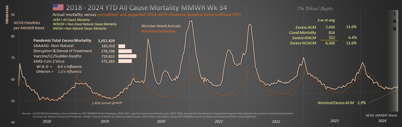
Again, I was the first to identify the 0.26% IFR in 2020 – and the CDC had to begrudgingly accept it over time. Again, I caught hell for this.
TES
That was you? LOL. I was watching the numbers bounce around in 2020 and remember 0.26% but didn’t get to check the source. Mar 16, 2020 6% (Imperial college), Mar 30, 2020 0.66% (Lancet), Apr 30, 2020 0.25% (Penn Med) and some others 0.75-0.85% then on May 24, 2020 0.3% (CDC).
At that point I was like “Back to work & school everyone” but no …
John Ionnidis had the exact same number. You’re in good company. Regarding Canada, is it possible they had some pre-exisiting immunity from The Sars outbreak in 2003? Less than 1,000 people died, so it’s unlikely.
Canada was exposed to proto-Omicron in 2018. This imparted some degree of immunity to Wuhan two years later.
As of September 2024, my father (a NASA Physicist and luckily for me – the best balance of intelligence, wisdom, objectivity, cautiousness, reason, strength, and goodness that I’ve seen in one person), is almost certainly one of the next to be taken by the “pokarama experiments.” The one decision I wish I could have known about in advance and dissuaded him and my mother from – is taking that shot – and the boosters. He was in perfect health until the initial dose, and quickly developed a problem with balance that none of the many Doctors who examined, tested, and… Read more »
Re: Sandy’s post on nicotine from 4 months ago (here in these comments). I had long been interested in trying nicotine, but had been hesitant due to being told so often it was highly addictive. After watching the video mentioned and seeing nicotine fail to produce addictive behavior when tested on its own, I recently ,ordered some patches and gum from the best sourced companies I could find. A pleasant surprise happened when my 24 year old son who had been dealing with asthma his entire life tried the nicotine gum and patch (lower range dose). Prior to nicotine, he… Read more »
I went through that nicotine presentation too, it cites relevant resources. But first, it is important to disconect it from tabacco use, as that involves thousands of other mostly harmful chemical, such as arsenic. Also, the presenter claims that it is pyrazines added by the tobacco industry which really make the smoking addictive. As of now, the safest way to absorb nicotine are nicotin patches. Some other studies also show that lower dosages are preferable, possibly even very small, such as the nicotinic content naturally found in tomatoes, eggplants, potatoes etc. And a huge topic for debate is whether similar… Read more »
When Omicron arrived (and your very good article with it), I said that it was the “free range vaccine”, because of its high transmission rate and low mortality, compared to the Delta COVID that went through my household in that same winter solstice 2021-2022(treated with ivermectin-cocktail to good effect).
Omicron did not bind strongly to ACE-2 expressing cells in blood vessels, lungs, etc and did not have an effective Furin Cleavage Site (but rather an ineffective one), so pathogenicity was reduced to the “common cold” coronavirus realm. Hallelujah! https://www.nature.com/articles/s41392-023-01449-w
Delta was horrid. Hit our entire family hard. None of us have ever been that sick before. Two extended family members in the hospital for weeks. Eliquis was a god send for my sister in law with the coagulation issues from Delta. We were denied access to ivermectin. “Go home and sleep it off, you should have gotten the vaccine.” That doctor needs to be decertified. Omicron was three days of 99.5 fever and a slight cough. In the old days we would have already known that Omicron was an entirely different and long-extant coronavirus. But not under our current… Read more »
I have included the closing excerpt from and the link to this post in the blog post I just sent out. https://drjohnsblog.substack.com/p/the-fundamental-reason
Delta recurred after stopping ivermectin 5 day course after 2 days asymptomatic, for a 2 week purgatory phase, despite resuming treatment. 2 family members who got significantly ill before getting ivermectin, had short hospital stays.
Interesting but I think I and my family had what Dr Michael Levitt called “pre-immunity” to covid because we never got anything until Omicron in mid to late 2022. Nothing since. I guess your family didn’t have that.
Your family probably caught the proto-Covid version of Omicron somewhere in 2018/19 and gained the necessary antibodies to stave off Wuhan-Alpha-Delta, much as Asian communities had the good fortune to experience. However, most HCoV’s mutate to a new infection cycle every 4 to 6 years. So when that strain you had in 2018 mutated, you caught it again. But again, Omicron was a separate/milder form of HCoV from W-A-D (although very closely related).
I wrote the original hypothesis and article on Covid pre-immunity here (and caught hell for it): https://theethicalskeptic.com/2021/11/15/chinas-ccp-concealed-sars-cov-2-presence-in-china-as-far-back-as-march-2018/
TES
Thanks I’ll give that a read.
Hey there. Thanks for what you are doing.
I have SMM (Smoldering Multiple Myeloma) that I found out 2 years ago, after the poison vax.
Do you see any mechanism that correlates blood disorders such as mine to mrna shots?
I read lnps gather at bone marrow and know that this disease is actually a mutation of plasma cells, so it certainly makes sense.
several different mechanisms of actions i have been collecting. https://www.youtube.com/live/1zv0JlrwPao?si=n9vp7X-ol0URU-6t https://youtu.be/liUg3eqyoZE?si=LnoPEOoP5uJJlb47 https://youtu.be/nbh_NB6LNaI?si=-y0P_1L1B_SzC4fs https://rumble.com/v4q174c-dr.-peter-mccullough-sounds-the-alarm-on-covid-vaccine-induced-turbo-cancer.html
I also have had concerning changes in health related to MGUS (really, MGCS because it’s producing symptoms), with paraneoplastic like changes, along with having all the gene markers for high risk progression and treatment resistant myeloma – before I even get myeloma. I never had any signs of disease prior to vaccines for Covid (mRNA from Pfizer) where I had progressively advancing severity in side effects after each dose (which included worsening pericarditis and central nervous system toxicity/inflammation resulting in temporary loss of sight and balance, amongst the symptoms). I now have a lack of ability to produce IgA immunoglobulins… Read more »
Too many “wrong” choices were made over the last 4 years to call it incompetence. IMHO the covid tyranny and jabs was maliciously executed for evil purposes. I watched Dr. John Campbell on YT yesterday called “organisms”. The intent was obvious is that they wanted to have this injected into as many human beings on the earth as possible. My Question: How how how were they able to execute this? And how successful it was is shocking. Its really sad the average human was either ignorant and/or compliant.
As you have a healthy following on X, I wanted to ensure that you’ve seen this interview with Dr. Bryan Ardis on the miraculous healing powers of nicotine — yes, nicotine, in curing myocarditis as well as Parkinson’s, MS, glioblastoma and autism.
https://rumble.com/v4g9qef-the-shocking-truth-about-nicotine-and-its-bizarre-nwo-connection-w-dr.-ardi.html
Does that include nicotanimide, NAD+, and NADH?
No, no relation.
So I should start smoking or chewing nicotine gum then?
This includes vaping?
TES, Gastroenterologist Dr. Sabine Hazan is saying that in her research she saw significant microbiome deficiency as a factor in both severity of covid disease but also as a lingering depletion due to vaccination (or in her words the vaccines killed the bifido and the loss persists but she was not able to publish this data) and potentially due to severe disease. She recommends Vitamin C for support of Bifidobacteria. She saw correlation between those that got ill and those exposed that did not get ill with respect to this particular bacterium. She also said that as you age you… Read more »
Dr. Sabine is dead on correct, especially with Delta. Everyone in our family groups got Delta at the same time, and the three older adults with depleted intestinal bacteria and dysbiosis/IBS all had pretty severe Delta. But even moreso, the studies indicated that this particular variant and pathway for Wuhan Covid, served to produce thromboembolism – which was left untreated (in favor of the vaccine EUA) and hundreds of thousands died from a very treatable condition.
ES – Not good but excellent analysis. The healthy (<0.01 IFR) and young (<0.001) with a chance of severe illness, hospitalization or death 10x to 100x smaller than seasonal influenza (0.1) were hectored, coerced and mandated to take unnecessary risk with a repurposed gene therapeutic which was known in advance to NOT PREVENT infection nor transmission. The mute chimps spoke volumes while the talking ones feigned deafness & lied through their teeth. To assuage fears and fulfill desires, self serving “needful things” will reject morals, ethics and forego freedom in preference of the collective over the individual. They did so… Read more »
Well said… and thanks.
Great overview! Thank you!
Have you looked at lumbrokinase as an alternative to (or in addition to) serrapeptase and nattokinase?
I did. I took it, and did not find it to be as effective as Nattokinase (which I had substituted it for)…
Nattokinase seems to be pretty good and well tolerated for coronary atherosclerosis, at a dose that is a hair under 12,000 fibrinolytic units per day. I saw a study (McCullough posted) showing that 40% of nattokinase arm had some plaque regression after a year. One would not take it together with other blood thinners, and most docs will be clueless. It seems to be helpful for one lady with pulmonary embolism from severe COVID, then :vaccination” X 3, and a host of subsequent medical complications.
Wow, the SAAAAD deaths leapt up in May/June 2020. I wonder what happened exactly at the time frame?
I updated the article with part of it – these are 40% ‘climate change deaths’ – a new emphasis on this instead of what really killed them.
I wonder if veterinarians keep any records of unexpected illnesses, because Facebook dog health and training pages are full of stories about healthy dogs dying suddenly with one or two yelps. This is outside my decades of dog experience.
Me and my spouse both use eBay UK a lot for our hobbies, the kinds of sellers who are anyway between business and someone random selling some clothes. Used to be those types always had 100% positive feedback, they cared, and it was normal, expected, since 2002. Now? 99.1%… 99.6%. 89%. Why? They were ill and failed to send the order. The buyer was grumpier than usual. Things didn’t work. “Personal stuff.” Sellers just vanish, after a short period of what seems like trying, or, they go toes-up, out of the blue. People who were solid for decades. May God… Read more »
Great to read another thorough analysis. Could the CDC wonder data be offset by illegal immigration in a way that would result in these trends? I have no idea how bad illegal immigration is but if the New York Post can be accepted they say 3.8 million illegal immigrants have entered the country since 2020. Assuming our health care system is caring for these individuals and their deaths are being reported to the CDC, could the US population be artificially inflated by 3.8 million people these last three years where a percentage of those are dying and showing up in… Read more »
Very few immigrants will contribute to the cancer tally for 4 reasons:
1. They tend to be young, and most cancers occur in the 68+ age years.
2. They tend to not report MCoD/UCoD, but rather ICoD, which is almost never cancer.
3. They may not report at all.
4. To the degree they do contribute, this is an ongoing contribution that is already contained in the 2014-2019 baseline itself.
Therefore, analyses which divide cancer deaths by (immigration-grown) population, are purposely fraudulent analyses.
TES
ES, once a month I get an immunoglobulin transfusion for Common Variable Immune Deficiency (diagnosed Jan. 2014). Because the immunuglobulin comes from soon-to-be expired blood from blood banks, I assume I am basically getting a shot every month (unwillingly). Do you think my assumption is correct? If so, do you believe your blackseed oil, nattokinase, serrapeptase combo will help or due to blood issues, will I be playing with fire? Add in — just to make it more fun — I have thalassemia. Any thoughts you may have would be greatly appreciated.
Steph, Of course I am not a physician and you should ask these questions of your doctor, before taking any advice from me. My impression however, is that blood in blood banks from now onward will contain factors resulting from the mRNA shots, yes. This could amount to be a hill of beans and nothing over time, or produce the same effects as the shots themselves – coagulopathy, heightened anemia, and hypoxic effects throughout the body. The truth is, that no one really knows. We took an enormous gamble with the shots. I believe that blackseed oil, nattokinase, and serrapeptase… Read more »
ES, Thank you so much for providing your input. I truly value your opinion!
Steph
check out https://safeblood.ch
Hi, thank you for your posts. They are great. I made the mistake of taking 2 doses of the Covid Vaccines. Is there anything I could do to avoid suffering all these consequences in the short term? Am I condemned no matter what? Serious question.
I am kind of healthy with no issues so far but getting nervous reading more and more, especially your blog. Thanks!
ETH, The odds as they fall so far, is that you will be fine. The question is, will this trim a couple years off your lifespan? That I cannot answer until we have more data. But that risk still exists under the mechanisms we have observed so far. However, yes – based upon the excess mortality breakouts I have produced, you can help protect yourself by countering endothelial, coagulopathy-thromboembolitic, and vascular damage with – blackseed oil – nattokinase – serrapeptase I started these as a result of my Delta Covid case, which hit me pretty hard with coagulopathy (the only… Read more »
Great, thank you for the tips TES! Take care and Happy Christmas :)
Thanks for all your hard work. Clinically it seems that the shot has accelerated aforesaid diseases to such an extent it gives the appearance that not being vaccinated protects you from stroke, cancer, etc. Time since last shot does not seem to be a variable regarding bad health outcome. Whatever epi/genetic factors lead to ‘suddenlies’ must be investigated, because the vaxxed life expectency per capita has significantly decreased and I don’t see that turning around. With what I’m seeing in my practice, no amount of money could induce me to get the mrna. None. Had I gotten the shot, I… Read more »
Thanks Jay,
Blackseed Oil, Nattokinase, Serrapeptase, did wonders easing my coagulopathy (thick blood). Even cured my rosacea as a side benefit. That was unexpected.
Thanks so much for all of your hard work. Youre an absolute hero.
Do you think that this bloodbath will ever be common knowledge or can they keep this hidden forever like they have so far?
If it fades to zero over the next year or so, they will be able to explain it away as Long Covid. The argument will echo on for decades. So far the overall excess mortality trend is not betraying its hand. It is staying level for the most part, at around 8% excess. My preference is that it duck back down to less than 1% (1-sigma) and we be done with this. No more excess death. But the warning categories (cancer, cerebrovascular, sudden cardiac, etc) do not suggest that this will happen. Indeed the opposite – in my best guess… Read more »
What would you say will happen once PFE expires?
At current state, the excess mortality will rise by ~ 4 percentage points. However, that all depends upon how these vaccine impacts progress and express over the years. The SV-40 impact took decades to find its peak and begin to decline. Or it could simply fade back to zero over a year or two (my hope). As you probably know, I shy away from predictions in that type of uncertainty.
Fair point. It’s that I tend to think that the worst is yet to come, likely because I tend to be drawn to what is the most pessimistic and frightening COVID research (Walter M. Chesnut with spike protein AIDS, Geert with the immune escape (Part of me thought about that with the 4 year immunity span that other countries had prior to Omicron, assuming your hypothesis is correct), or Kevin McCairn with prions). On one hand, I recognize that horrid anxiety that I had years prior to 2020 definitely influenced me going down the rabbit hole, but I also don’t… Read more »
Thank you, unfairly-maligned-skeptical-analyst, for this careful teasing-out and rigorous breakdown of excess deaths, notably in 11-12 Sigma statistical range for cardiac and cancer deaths in the younger age cohorts. This corresponds to what I have been seeing in my personal/social group. A lot of people are being diagnosed with stage-4 cancer and dying shortly after that. I do wonder where stroke-morbidity is showing up, because I think there are more strokes than usual. Stroke mortality would be easier to pull out when immediate, but that is always some fraction, maybe 20% of deaths related to strokes. The other 80% languish,… Read more »
Thank you John, Stroke is contained in ICD Codes 160-I69, which is up 12.2% after mitigation by pull forward effect. In reality, it is probably at ~20% excess, once my conservancy is removed from the analysis. In addition, there are 18,600 circulatory deaths, which contain stroke as an MCoD, without a true known cause of death (R99). This, tapered over 33 weeks, could serve to add another 3 to 5 percentage points – making the true excess just shy of 25% As you can see, categorization plays a heavy role in hiding many of these numbers. The Narrative pushers can’t… Read more »
It’s interesting comparing your US estimate of 1,171,750 vax & C-19 measures excess deaths versus the 860,000 estimate by D.Rancourt et al (based on 1 death in 800 injections) US estimate which he estimated 17 million vax related deaths globally… which means that if all deaths caused by C-19 measures are included, would imply a global number north of 20 million… Yikes!
Another fascinating analysis!
This is what Excess Mortalities vs previous years, looks like outside the US… Our World in Data .
https://tinyurl.com/2uh5ezea
Analysis by Deep Dive – Dec 10 Substact
https://deepd1ve.substack.com/p/when-no-control-group-is-necessary?nthPub=1081
One things that kind of stands out there is Bulgaria and Serbia are pretty high, meanwhile there vaccination uptake was pretty low. South Africa is another one.
See Chart 4b – the trend, now the noise is removed, shows that Bulgaria and Serbia are faring well, compared to their more heavily vaccinated peers.
Thank you for doing the digging into the numbers and putting what you are finding into an understandable format.
Thanks Bessie!
TES
I would add that the last 50 years of murder by big pharma drugs under normal usage parameters would easily surpass 10 million.
Need to add in deaths caused by hospitalization including incorrect treatment for covid, neglecting to treat other conditions such as pneumonia, calling everything covid regardless of what it is, etc.
Agreed. That is in Chart 1 and listed under ‘Disruption and Denial of Treatment’, and furthermore is included inside the tally of the dead, depicted in Chart 13.
TES